Design Spotlight: The KIBO Tactile Art Board
Accessible products often prioritise function over experience, resulting in solutions that work but feel visually bland. KIBO takes a different approach, showing how inclusive design can be colourful, tactile, and enjoyable to use without being defined by disability. This Design Spotlight explores the design decisions behind KIBO and the lessons they offer for inclusive, real-world design.
9th February 2026 • Case Studies
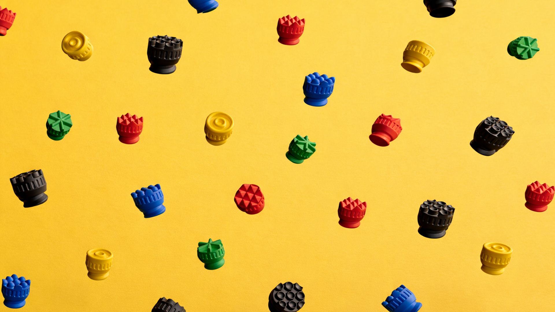
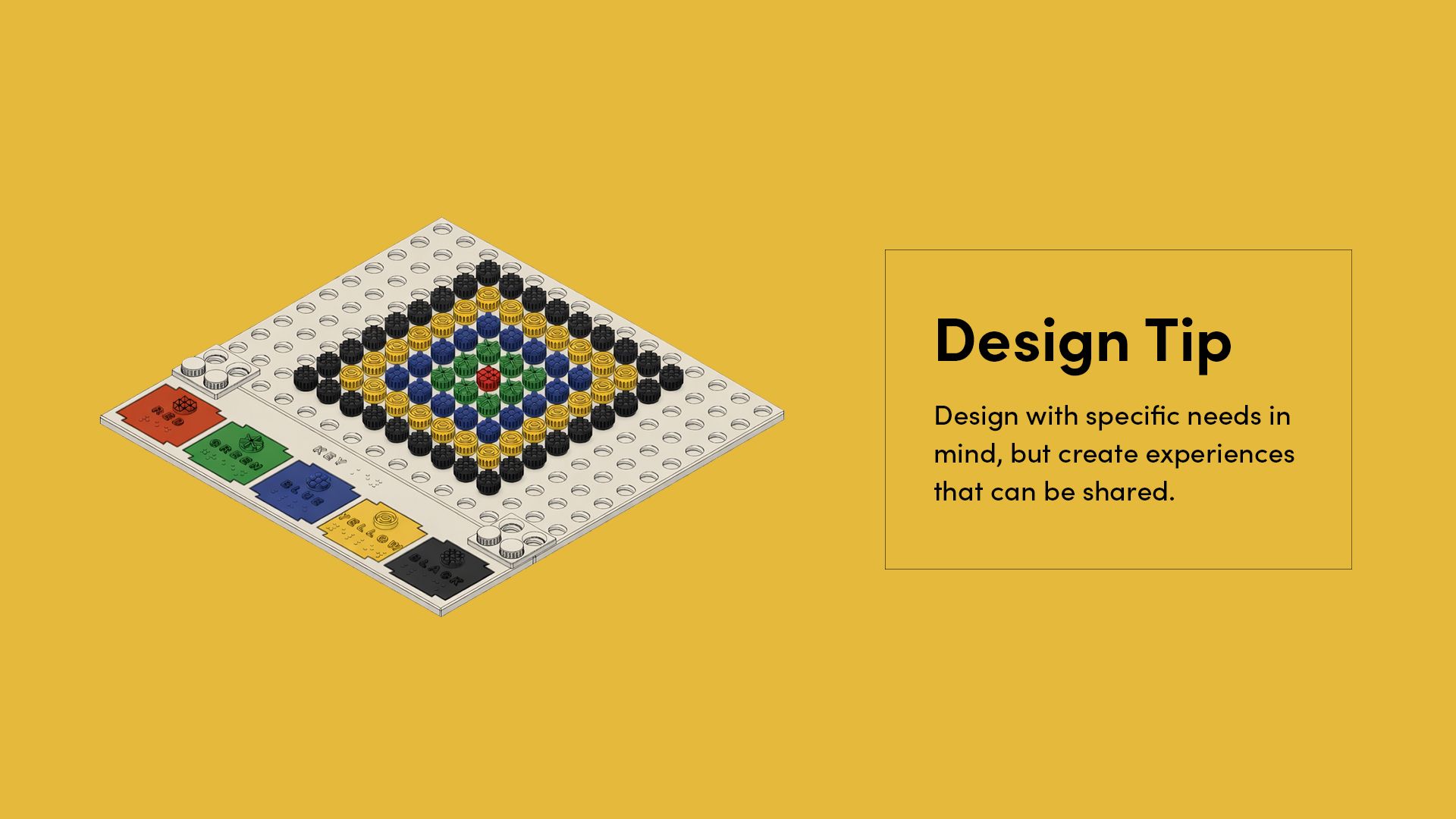
KIBO is a 3D printed tactile art board designed by Gabriela da Silva, a Brazilian mechanical engineer working in new product development and industrial design. Created as part of the Make:able Assistive Technology Challenge, it allows users to create designs by screwing textured, colour-coded bolts into a grid.
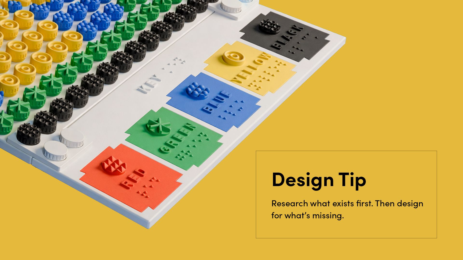
Each texture represents a different colour, allowing designs to be read by touch, while a braille and text key links each texture to its colour name. The system supports children with partial or progressive vision loss and can be used collaboratively by both sighted and visually impaired users. Check out Gabriela’s submission video below:
KIBO stood out to us for how thoughtfully it balances accessibility, desirability, and manufacturability. Rather than relying on complexity, the design focuses on a small number of well-considered decisions that make the product intuitive, durable, and enjoyable to use. Below, we highlight the key design choices that made this project particularly strong, along with practical takeaways you can apply to your own work.
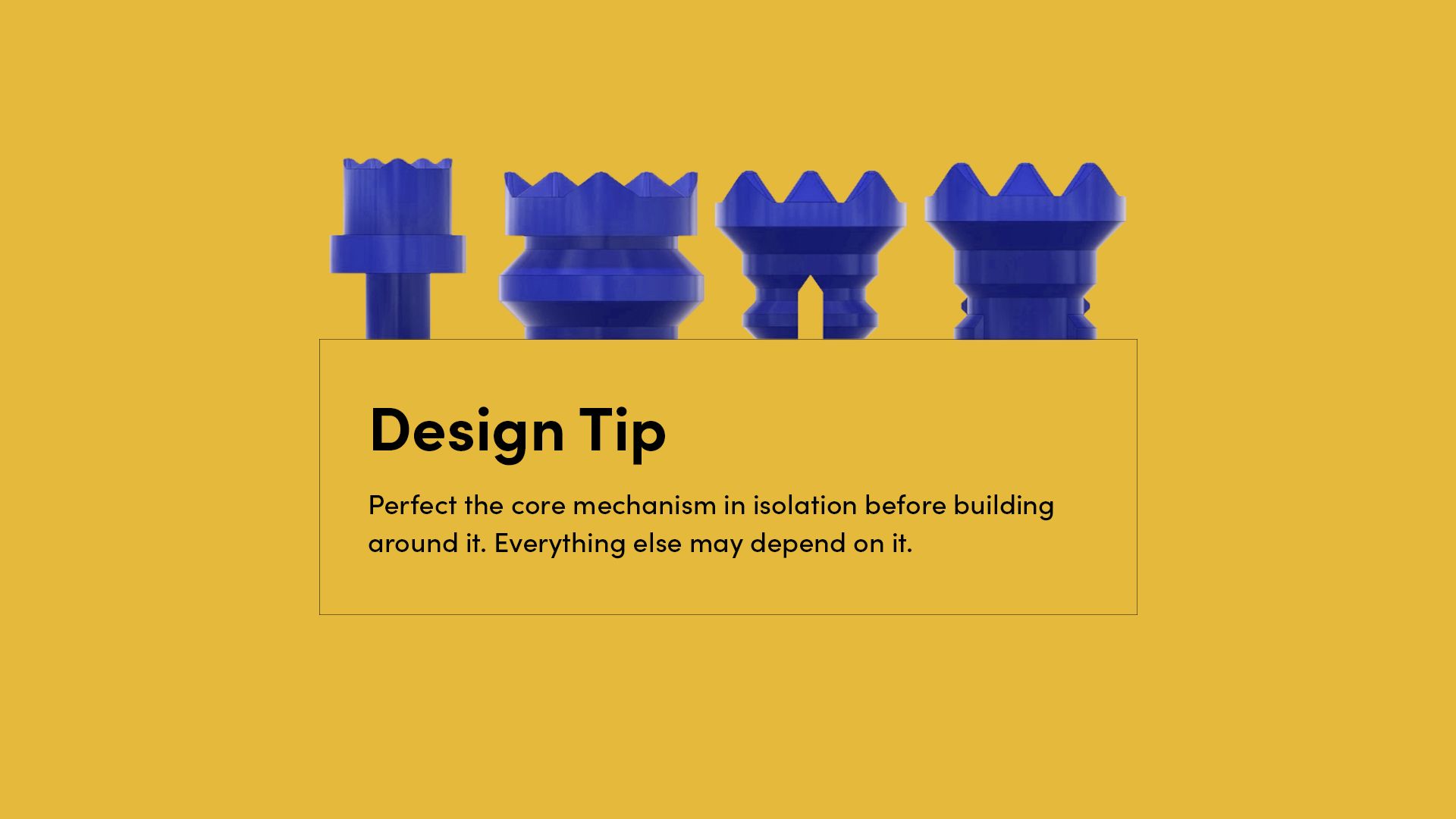
Perfect the Core Mechanism
A significant amount of time was spent exploring how users would physically connect the bolts to the board. Gabriela tested several options, including friction and snap-fit mechanisms, before selecting a threaded screw for its durability under repeated use.
Rather than rushing the decision, she refined the thread profile and proportions through multiple iterations. Although a screw can sound complex, it was designed to require only minimal rotation, around a quarter turn, making insertion and removal easy for young users. The bolt was also stretched vertically to reduce overhangs, improving 3D print reliability and producing cleaner threads.
If the core mechanism had not been resolved properly, it would have created a chain reaction of issues, from wear and loose connections to frustration during use. By perfecting it early, the rest of the product was built on a reliable and comfortable foundation.
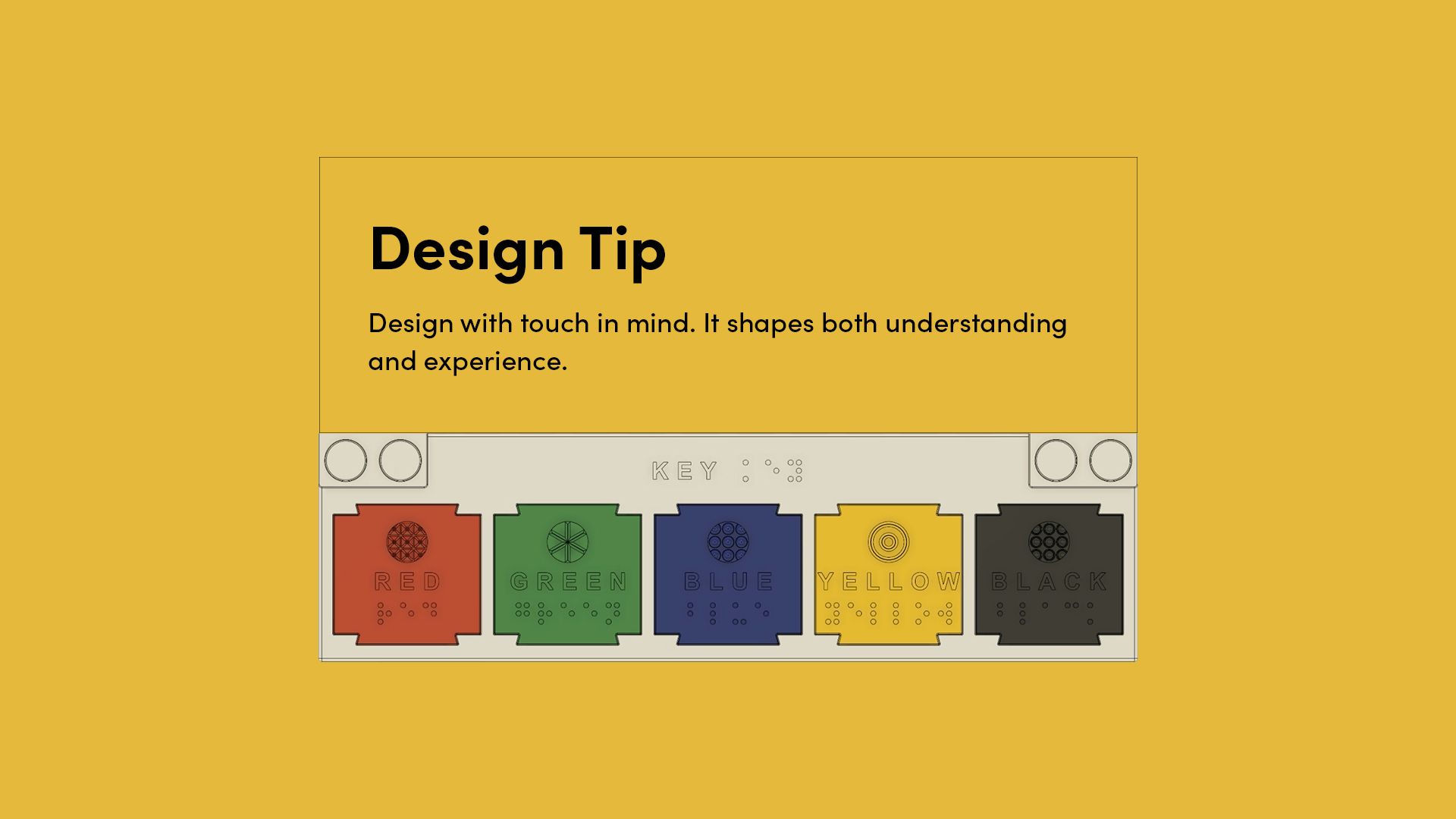
Visual and Tactile Cues
KIBO communicates through more than one sense. Each bolt uses texture to represent colour, while the braille and printed key reinforce the link between touch and visual information. The textures and grip grooves also improve handling, making the pieces comfortable and satisfying to use.
By combining visual and tactile elements, the board supports children with different levels of vision while remaining intuitive for sighted users. Designing with touch in mind strengthens both communication and physical experience, showing how accessibility can enhance usability and enjoyment at the same time.
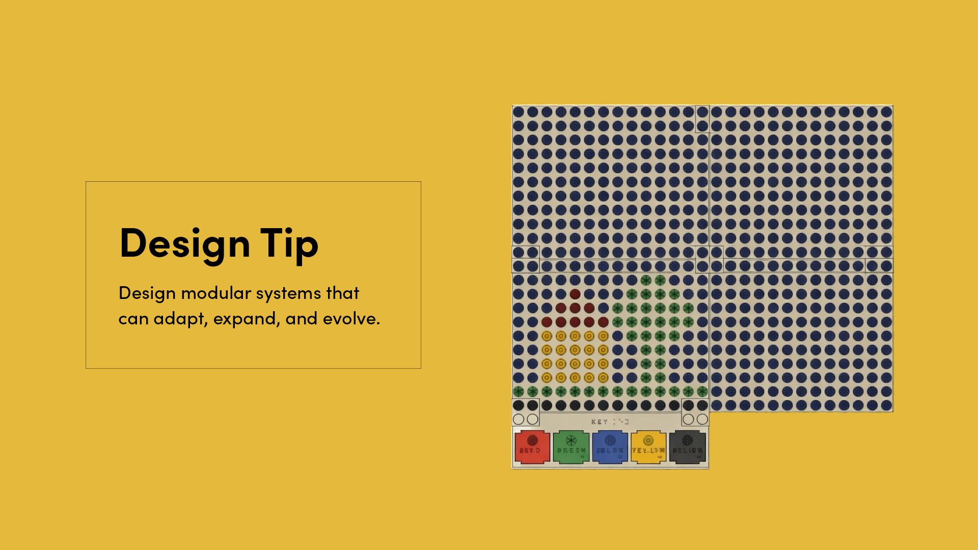
Modularity to Enable Easy Adaptation
Modularity in KIBO extends beyond interchangeable parts. The braille key is designed as replaceable tabs that can be reprinted and swapped when needed, but the board itself can also be expanded. Connector pieces allow multiple panels to snap together, increasing the size of the art surface without redesigning the system.
This approach makes the product adaptable in more than one way. Colours and language can be updated, damaged parts can be replaced, and the board can grow with the user’s needs. By thinking in systems rather than fixed outcomes, Gabriela created a design that remains flexible over time.
Design for Inclusive Use, Not Separate Users
KIBO was designed in response to the needs of children who are visually impaired, but it was not limited to them. From the beginning, the goal was to create a shared creative experience that could be enjoyed across different levels of vision.
The combination of colour, texture, and tactile interaction allows children to create and interpret designs together, without separating the experience into “accessible” and “standard” versions. This reflects a key principle of inclusive design: when you thoughtfully design for a specific need, the result can often extend naturally to many users.
Build on Existing Products, Then Address the Gap
KIBO did not begin from a blank slate. Gabriela drew inspiration from existing Lego-style art boards and tactile maps, analysing what already worked well before developing her own solution.
Through this research, she identified a clear gap. While tactile tools exist for children who are visually impaired, many do not meaningfully incorporate colour, limiting their relevance for children with partial or progressive vision loss. KIBO responds directly to that gap by combining texture and colour into a shared creative language.
By studying what already exists and asking what is missing, designers can avoid reinventing the wheel and instead focus their energy where it has the greatest impact.
—
KIBO is a great example of how thoughtful design decisions can transform a simple idea into an inclusive and engaging product. A big thank you to Gabriela da Silva for sharing her work as part of the Make:able Assistive Technology Challenge and for demonstrating how accessibility and desirability can go hand in hand.
You can download and make your own version of KIBO via the official Printables page here, and to connect with Gabriela and see more of her work, visit her LinkedIn profile. We look forward to featuring more projects in this series, each offering practical insights and design lessons you can apply in your own work.
Interested in creating your own inclusive products? Join the Make:able Challenge to access the free online toolkit and start designing for real-world impact.